 There's no denying that data is not the most inherently pretty thing to behold. An Excel spreadsheet, after all, is not exactly a Monet. Even if you have a thoroughly organized spreadsheet, there are definite benefits to making it more visually appealing. Beyond simply adding color or editing fonts, this effort should be focused on making your data more digestible for your audience. This way it can be easily shared with and understood by your higher-ups and end users, and in turn they can use it to drive actions and provide the basis for smart decisions. Enter: PowerPivot.
By using PowerPivot, you're setting yourself up for success
PowerPivot is an add-in from Microsoft that can be installed for various editions of Excel—including 2010 and 2013—geared toward self-service business intelligence. We're going to outline some of its most useful properties below, all of which are delved into further in the video embedded above.
Use PowerPivot to organize significantly more data than with Excel alone. With PowerPivot there are no limitations on column data so you can analyze millions of rows or records. Excel 2010, on the other hand, has a limitation of 1.048 million rows.
And while we're on the subject of organizing data, you can harness PowerPivot's ability to integrate data from multiple sources and have them relate to each other. The add-in creates a dashboard view that makes data very easy to import and interact with. Once the data is in PowerPivot, you can't edit it—though you can refresh the document. This means that if data was altered in the source document, this change will also appear in the dynamic PowerPivot spreadsheet.
Also, you can easily filter out unwanted columns or rows, rename the columns, rename the data elements and use the language of Data Analysis Expressions to conduct calculations. While the syntax of these DAX functions is similar to traditional Excel formulas, it also allows for more complex and sophisticated grouping and calculation.
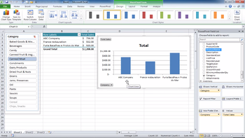
Finally, take advantage of PivotTables and PivotCharts to create your final presentations. You can add these to output visual data to an Excel worksheet. Within them, you can use Slicers to conduct simultaneous filtering. For example, if you're looking at a list of inventory organized by location, you could turn off several of these locations or inventory categories at a time and immediately see how the data changes accordingly.
Want to learn more about specific tasks within PowerPivot? Click here to access targeted videos on importing and manipulating data, creating and managing relationships, creating PivotTables and PivotCharts, and much more.


