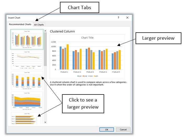
 Microsoft Excel 2013 has a button called Recommended Charts that helps users select from a list of customized charts that will best fit your data. You can have beautiful, easy charts in just a few clicks. Users can hover over the choices to view a live preview of the chart before deciding on which style works. Follow the steps below to view and select one of the available chart options.
1. Select the range of data you wish to chart (use Ctrl + A if selecting the entire range).
2. Click the Insert tab / Charts / Recommended Charts.

3. The Insert Chart Dialog box appears with a list of Recommended Charts as well as a list of All Charts that are available.

4. Click to insert the chart you like.
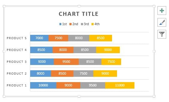
5. Make adjustments to the chart use either the Chart Tools ribbon tab found up at the top or Options button located in the upper right side of the chart.
Now, creating charts is as simple as selecting the data and clicking on one of the chart options.


